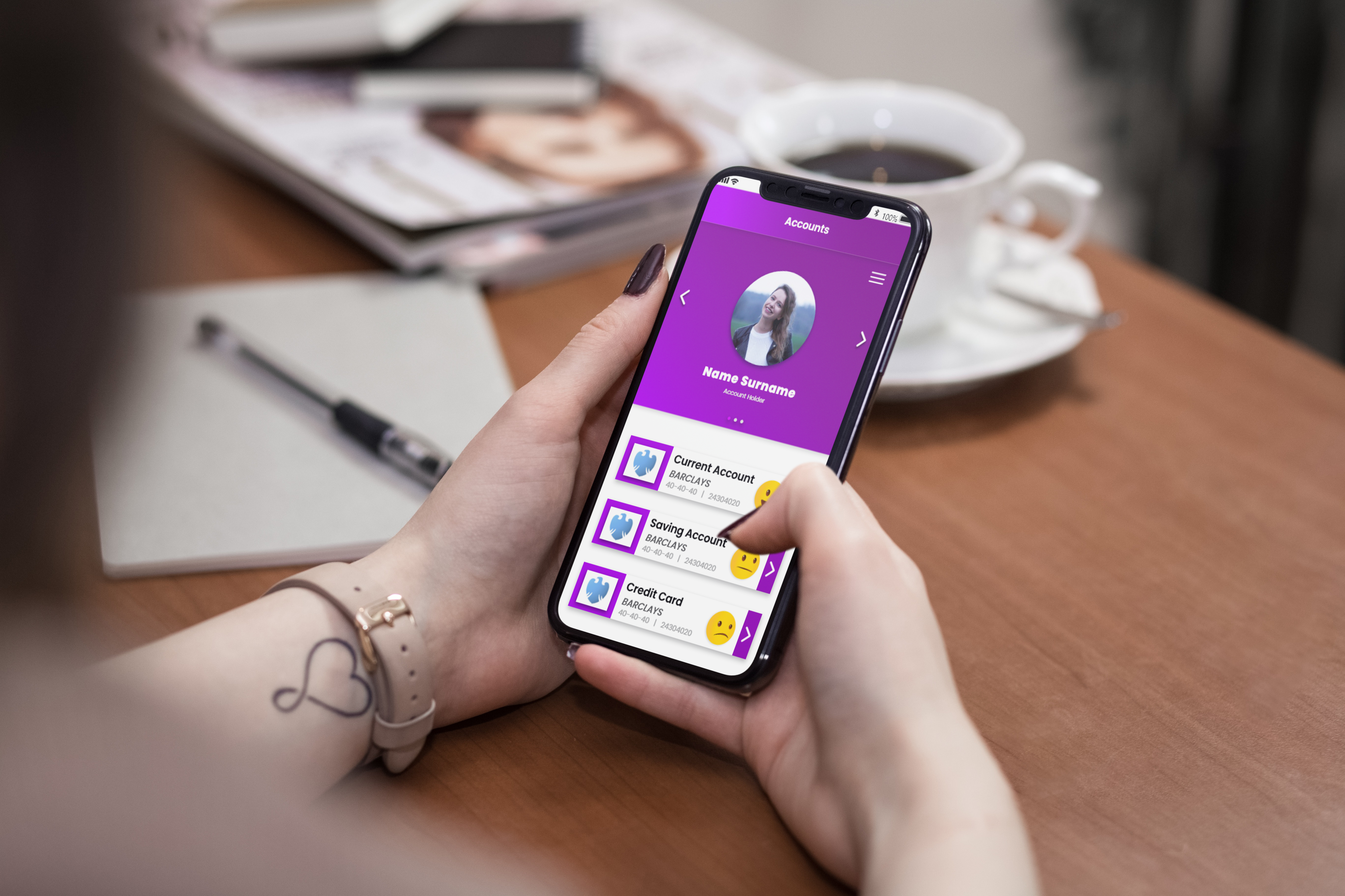
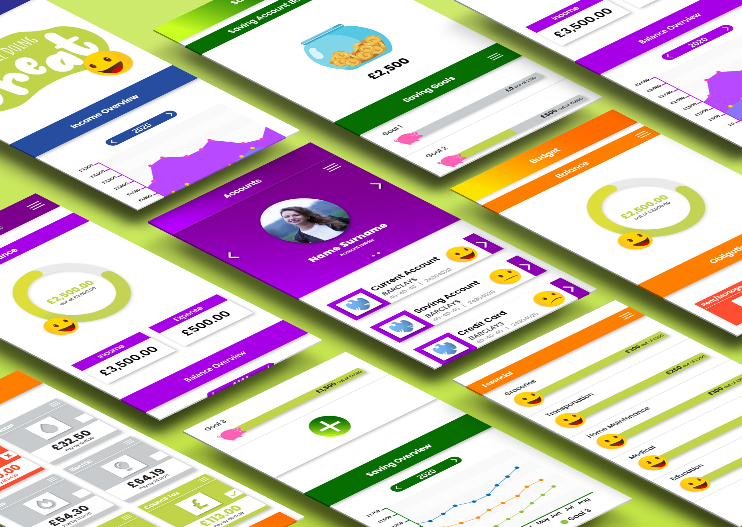
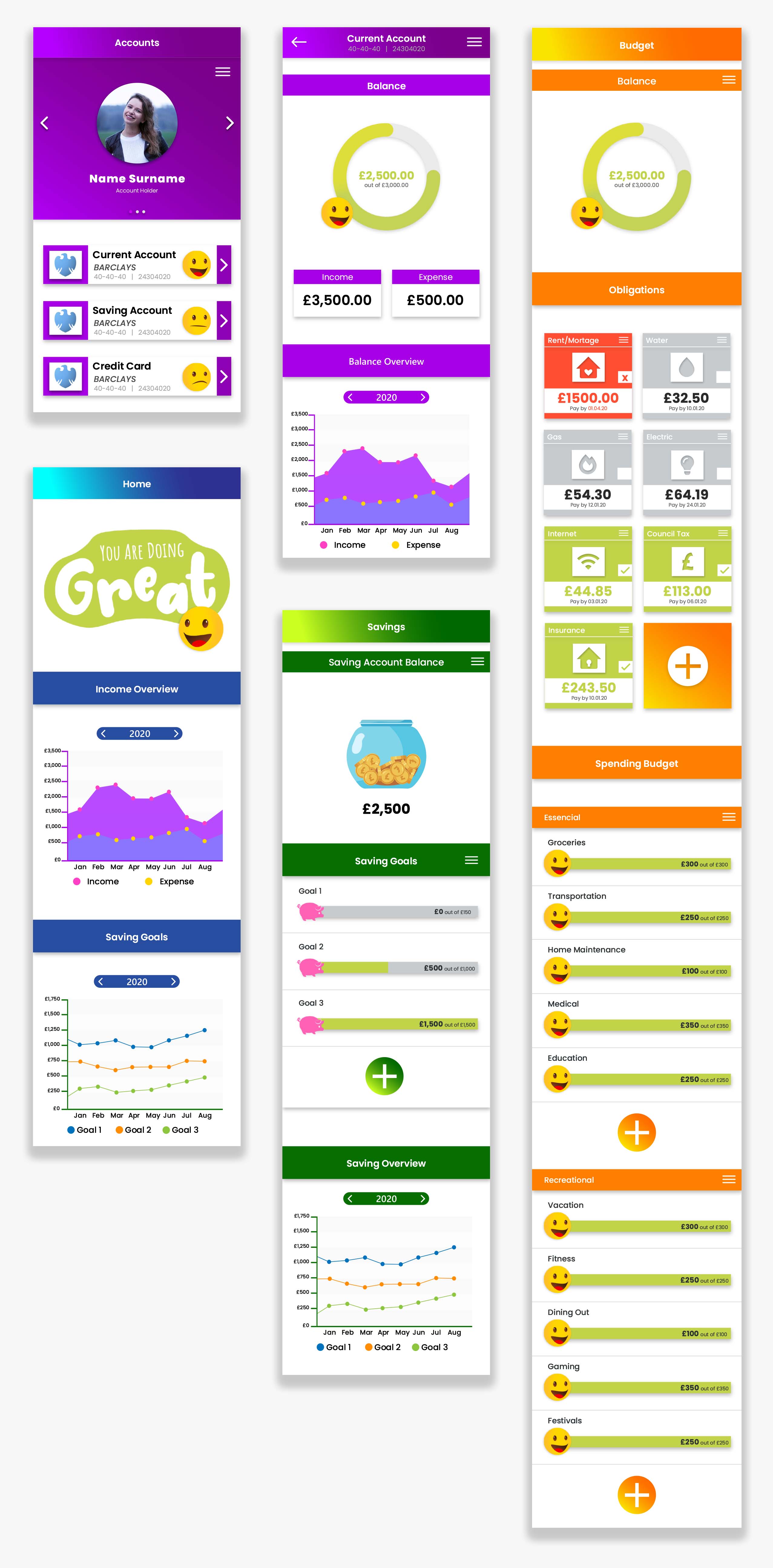
I created the PiggyBank app as the answer to university brief where I had to investigate and create a service / user experience-inspired response to the theme: ‘World Revolution'. I explore social, cultural, historical, political and economic issues that exist around the theme to add a measurable benefit through a considered design experience. The project aims to develop service propositions that produce more integrated and sustainable community relationships.
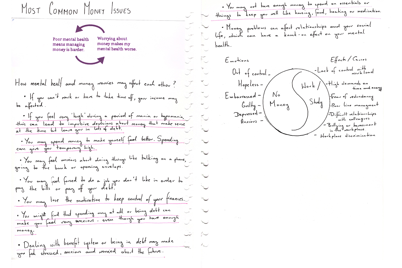
1 in 4 people in the UK are struggling with mental health, money and mental health are often intricately linked, one problem feeding another. Especially in times when jobs aren’t secure anymore and the whole world is going into lockdown with unclear future.Managing money became very important during the Covid-19 pandemic. The budgeting became much more stressful than it already was, therefore, the app like mine became much more needed.
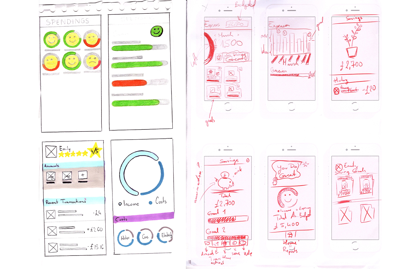
Working for people not for profit. My design was informed by medical studies, articles, movies, interviews and face to face conversations about the struggles involving money. Often times the user have a low income and big expenses compared to the income, therefore a clear plan of how the money should be used is crucial. I tried to stay away from personal biases much as possible by frequently evaluating and validating my design steps with my target audience and making sure that what I do is what they need and not what I want.
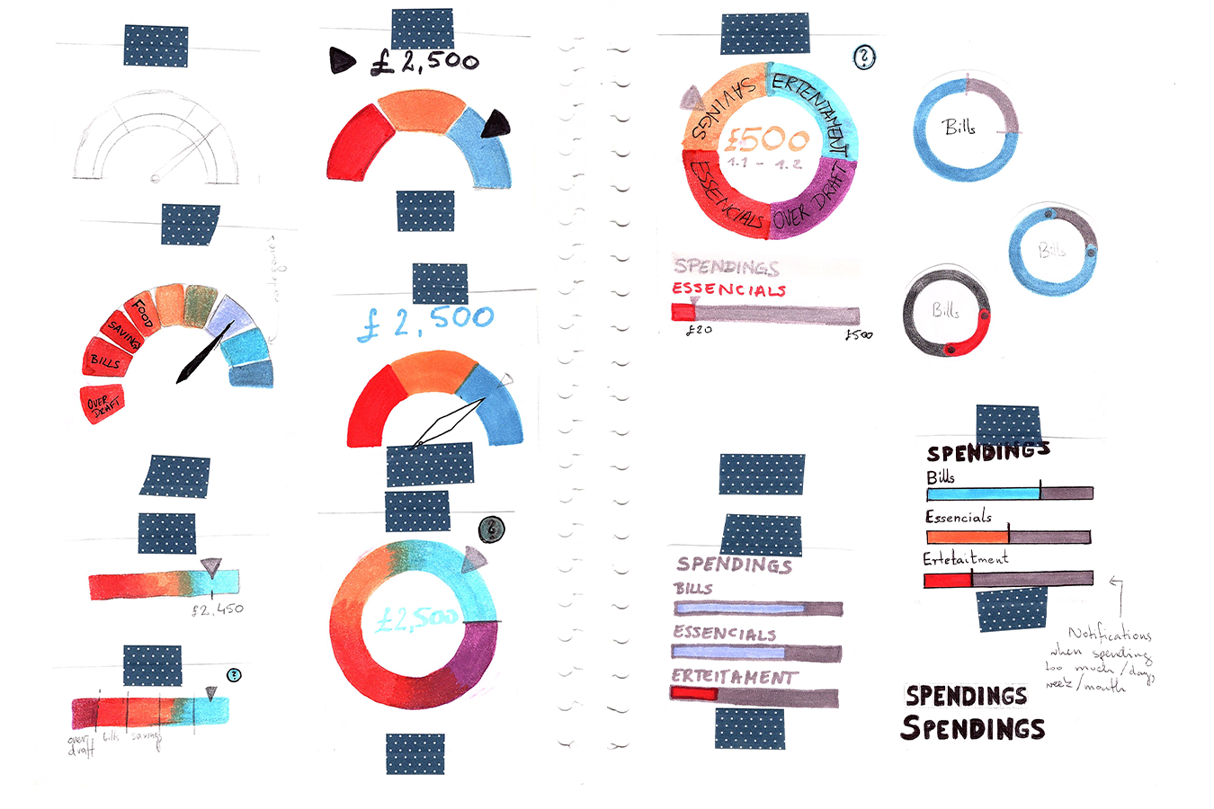
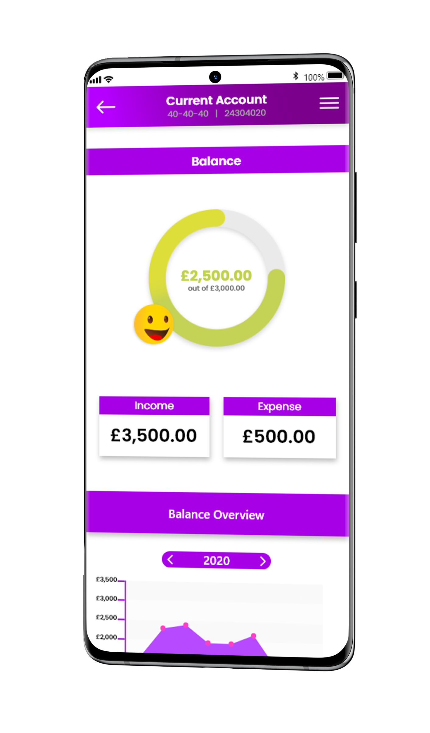
The biggest challenge while working on the app was its interface. I had to ensure that the app presents the information clearly and quickly, but at the same time doesn’t overwhelm already stressed users. Another aspect was the app’s accessibility; I had to find the perfect balance for each element. Due to the fact I couldn’t test my idea, it was very difficult to develop the idea. I had to put myself in the user’s position to the best of my ability and see if the position, size, colour of the elements and image representation like emojis are helpful.